Internship, 2017–2020
Close to one hundred design pieces, thousands of event photos, and (hopefully) a few classes of happier new students
Print, Digital, Branding, Presentations, Web, Photography
Photoshop, Illustrator, InDesign, Lightroom, Premiere Pro, Office, Drupal, HTML, CSS
Kindness and Positivity, Education and Progress
As a student at Cal Poly, San Luis Obispo, Orientation played a pretty substantial role in my college career. I volunteered as an Orientation Leader for three years, trained other Orientation Leaders for two, and also worked as the department’s Multimedia and Marketing Intern from 2017 until the end of my time at Cal Poly.
During my time in the office, I answered my share of phone calls, managed to memorize our school’s fight song frontwards, backwards, and sideways, and designed close to a hundred pieces for print and web use (time flies!). I also photographed events, helped run AV in our Performing Arts Center, and pieced together some Drupal 7 workarounds to get our website template a little closer to workable.
Below are just a couple of pieces from my time with the department, plus some bits about what I learned throughout. If you’re curious, feel free to reach out for more details and to ask questions about my time with Orientation—or to hear my (very poor) rendition of our fight song.
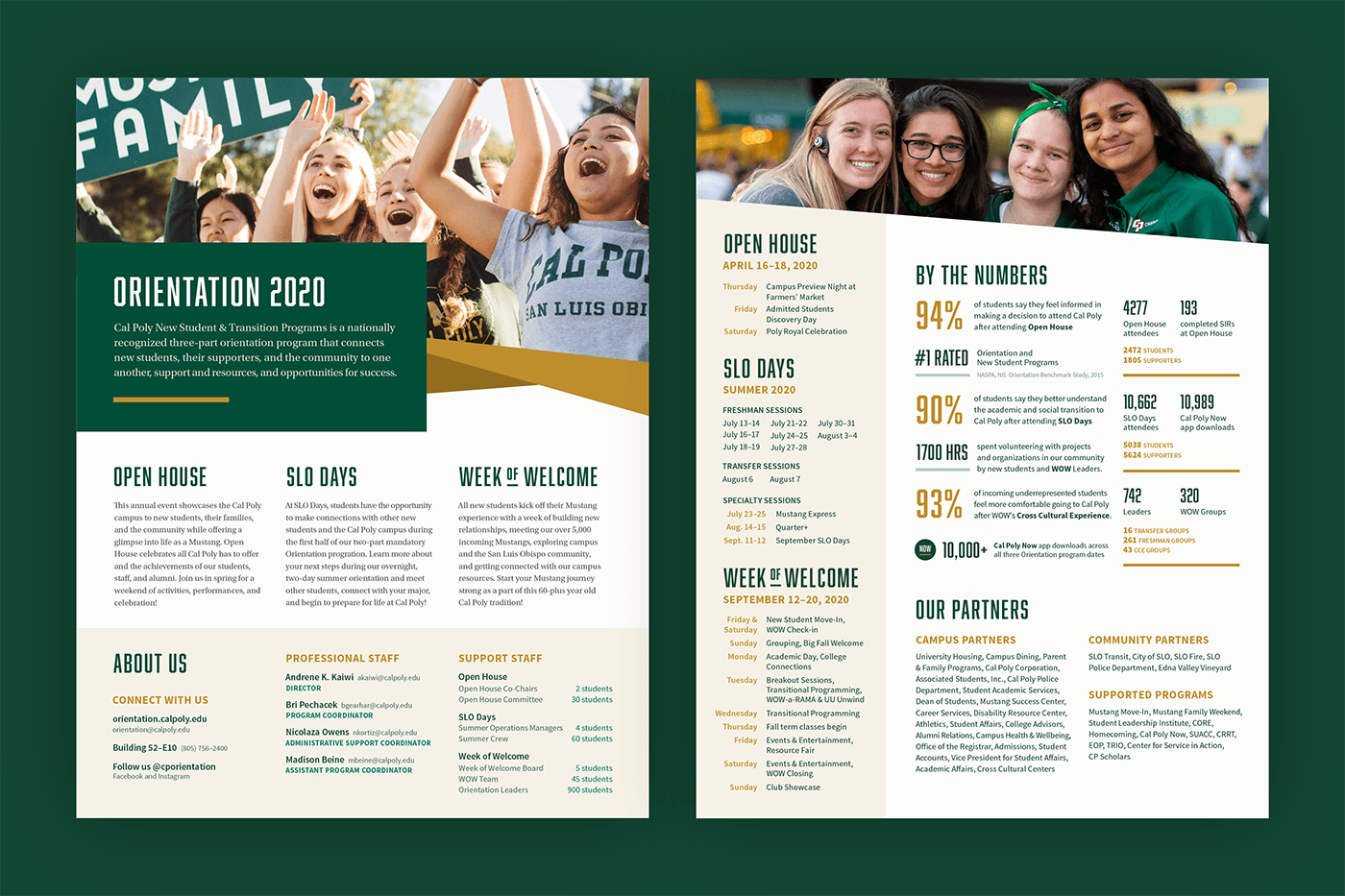
One of the print projects I designed annually was the New Student and Transition Programs (NSTP—the official name for Orientation) One Sheet, which provided an overview of our programs, our staff and partners, and data on student outcomes. We distributed these to campus partners and kept a few in the office to reference for quick answers during phone calls.
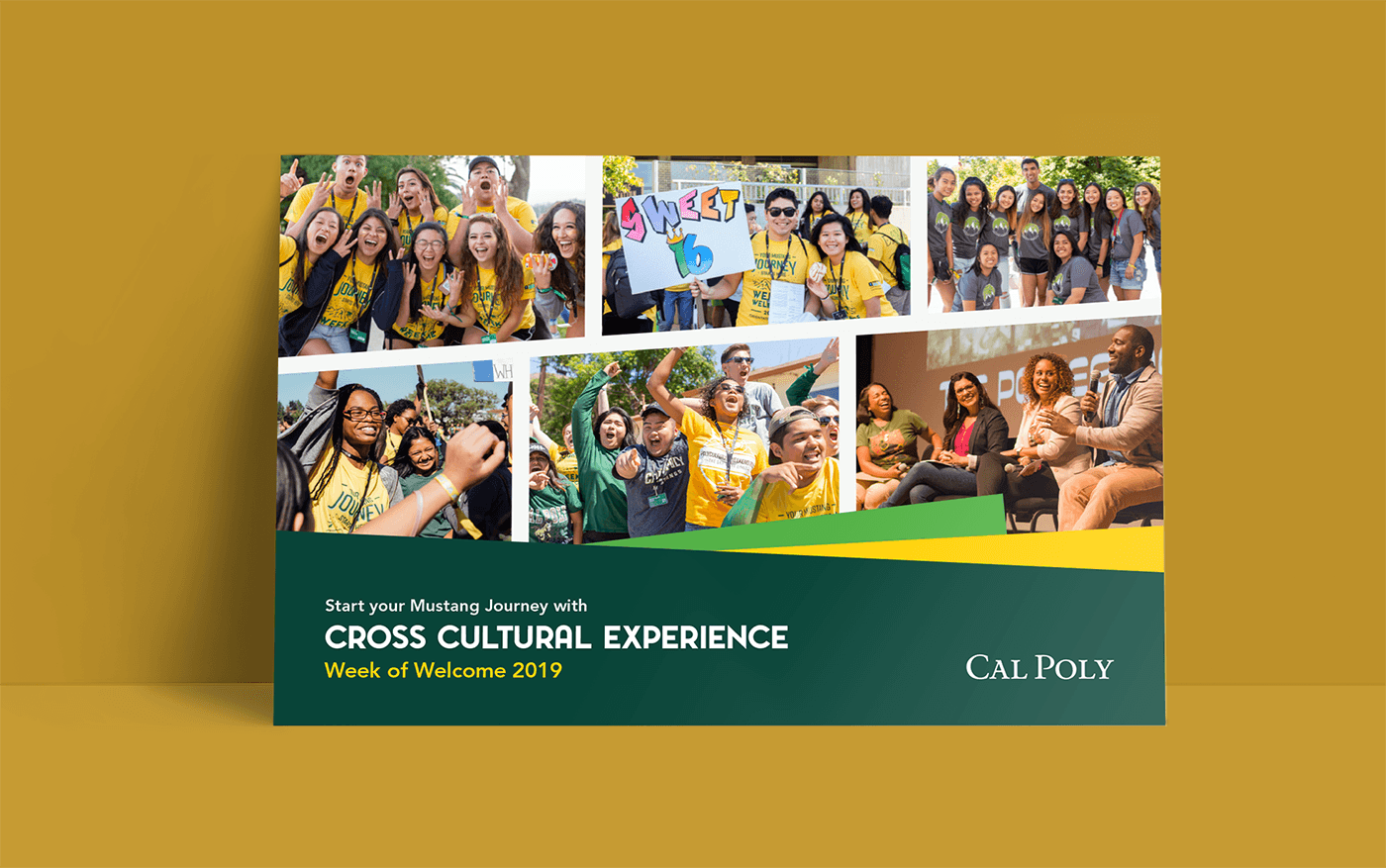
I designed mailers, postcards, and handouts for all three of our main Orientation programs—Open House, SLO Days, and Week of Welcome—as well as for individual programs within them, like the Week of Welcome Cross Cultural Experience. These were both mailed to students and distributed on campus.
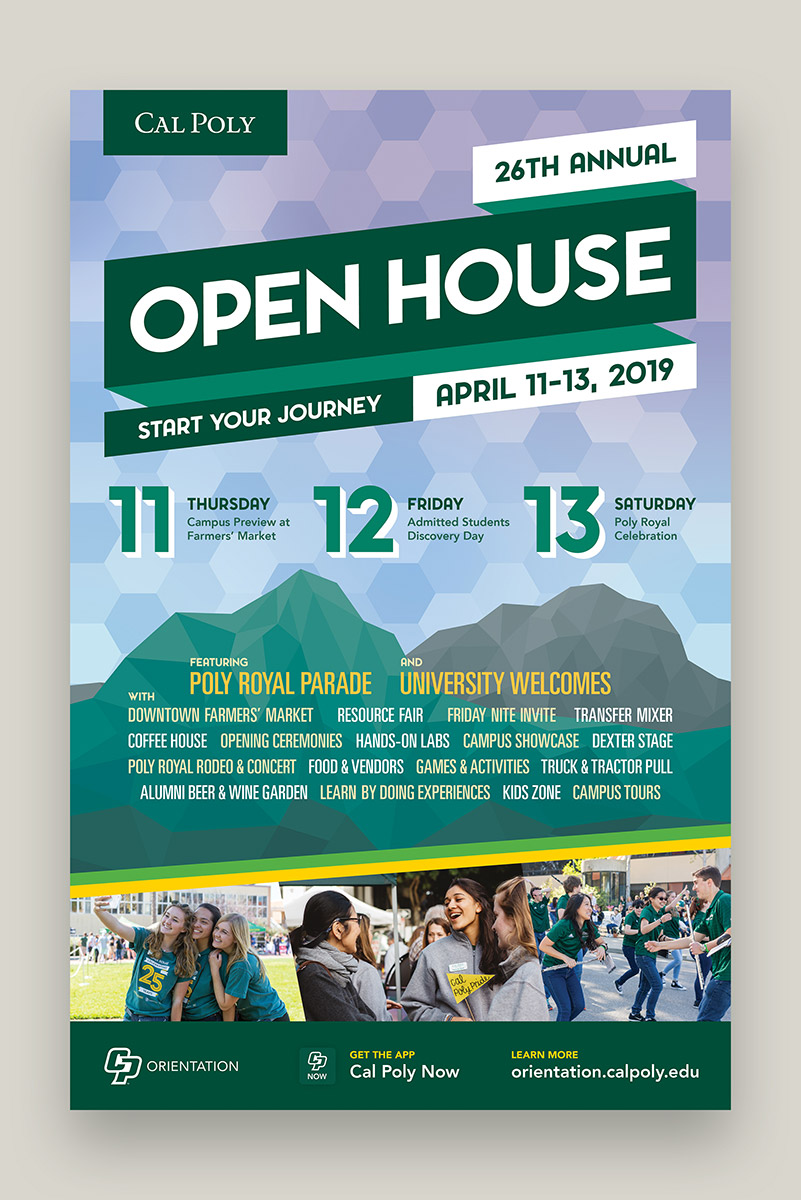
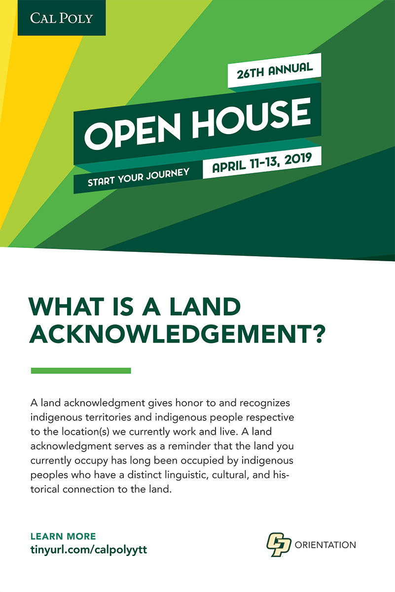
Cal Poly’s annual Open House brings current and prospective students and supporters, alumni, and community members to campus for a weekend of hands-on activities put on by academic departments, clubs, and organizations. I designed posters, mailers, and other promotional graphics for Open House, like the poster above for Open House 2019.
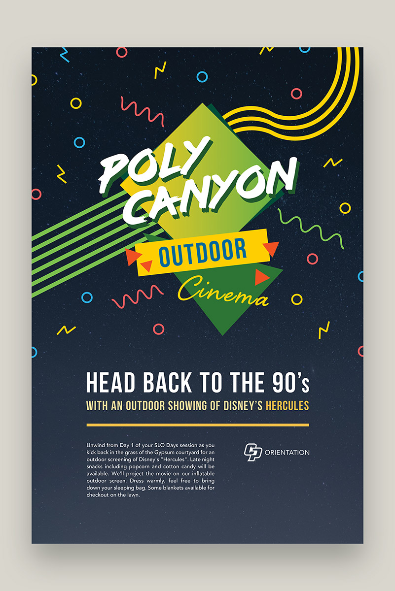
I even had a chance to work on some themed content for specific, one-off events, like this poster for Poly Canyon Outdoor Cinema (with some late 80s movie theater vibes) during our summer orientation sessions.
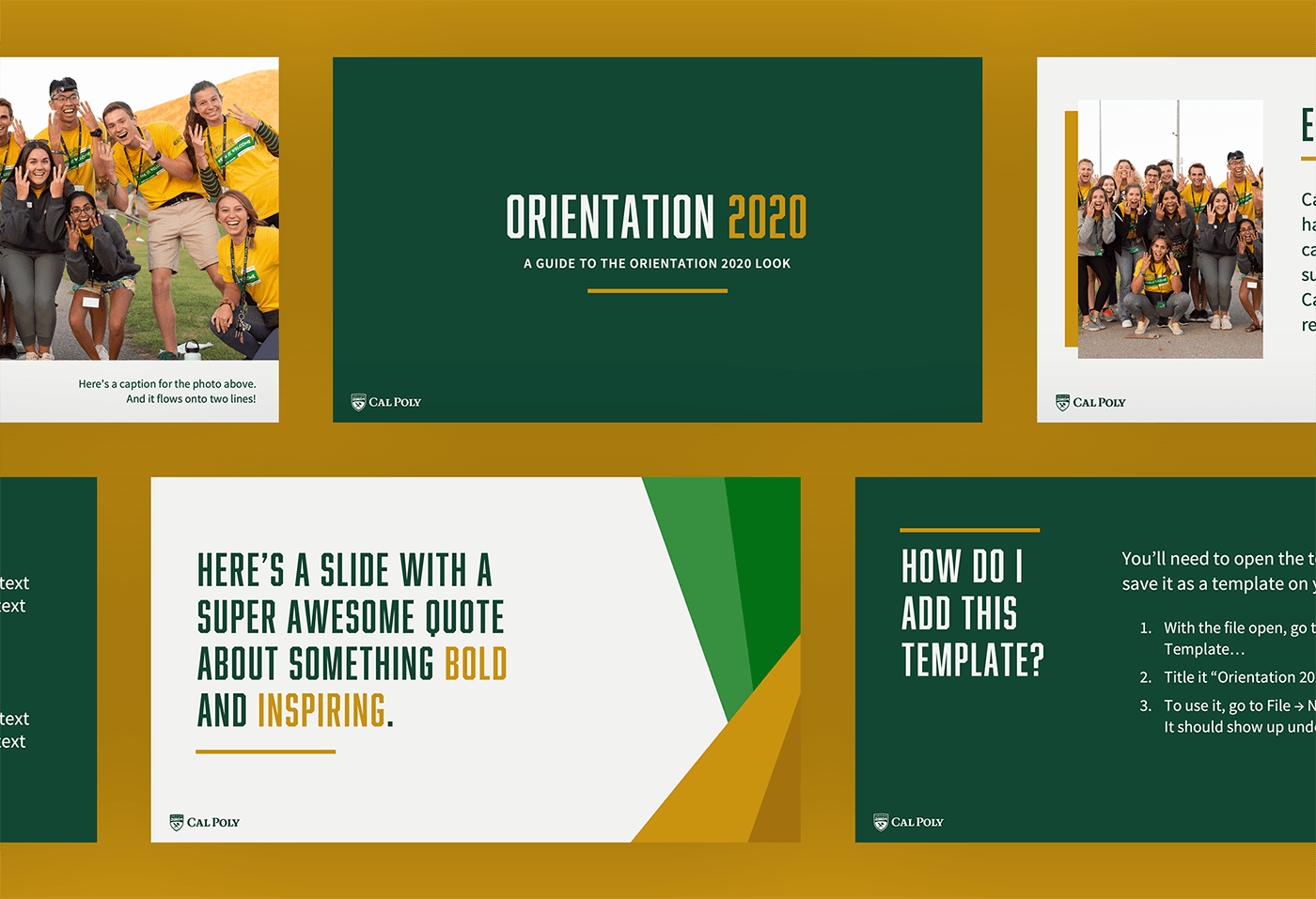
Partway through my internship, our entire university rebranded—colors, typefaces, the whole gamut—which meant all of our materials needed to be redesigned from the ground up. I actually loved getting to design within those constraints across print and screen and the challenge of figuring out how to create pieces that, while cohesive with the brand, were uniquely ours.
I designed a PowerPoint presentation template based on the new university colors and type (ignore my snarky placeholder text). Shown above are slides from the template file itself—other staff and students then flowed in content to make each presentation their own. Decks made with the template were seen by hundreds of students and supporters from across the university.
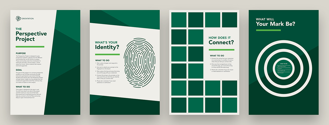
While I usually worked on print or digital pieces, this one stood out just because of how different it was—a big physical installation piece for our annual Open House event. I designed eight panels, one for each activity our Open House Committee created that would help students engage with and better understand their identity and how it fit it at Cal Poly.
Once I had designed these digitally, we had transparent stickers printed with the text and more detailed graphic elements, while all of the color blocking and larger elements were hand-painted by members of Open House Committee onto 4x8-foot panels and then assembled into the final installation piece.
Each new student attending their first orientation session gets a packet of information stuffed inside a folder, above—I was able to design the folder as well as some of the interior pieces, like a “Roadmap to Cal Poly” showing steps to complete before arriving in the fall, flyers showing how to download the Cal Poly Now app, and more printed tidbits.
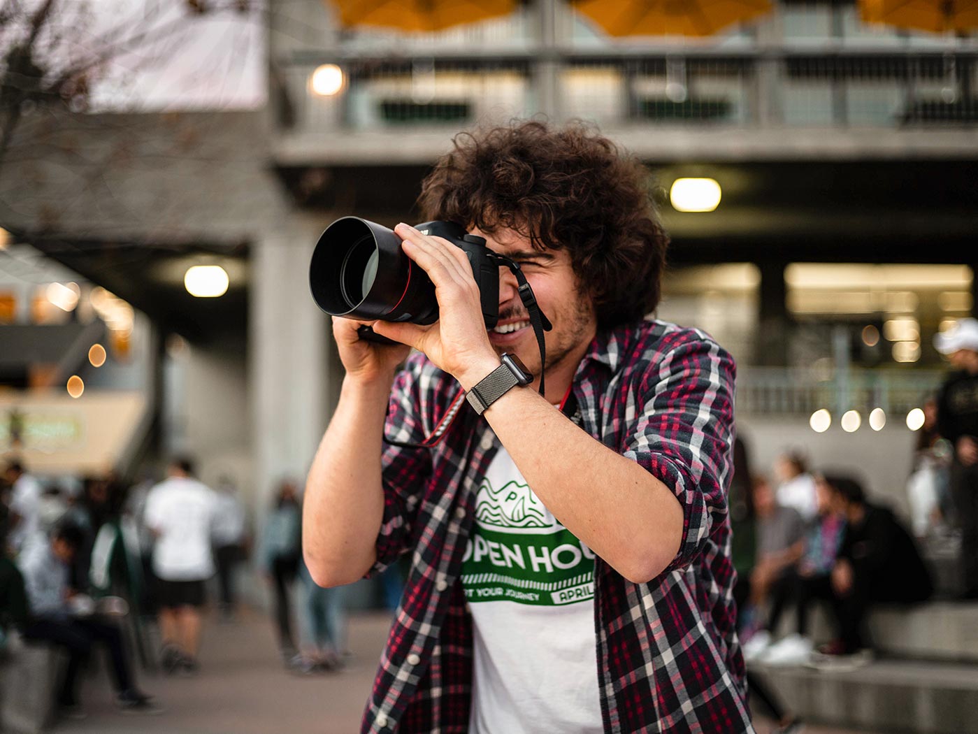
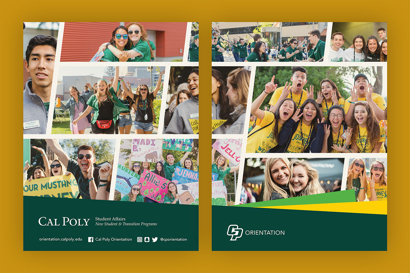
Here’s me with my photographer hat on during our annual Open House—I also designed the shirt I am (and the other staff and volunteers are) wearing in this photo. The photos and video we shot during these events would end up driving our marketing materials the next year. Credit for this image goes to the very talented Nick Tolas (thanks pal!).
During my internship, I worked with several different teams of students and staff members, many of whom provided support, much-needed feedback, and some really awesome project briefs. Credit goes to each of the student leaders who worked with me to make sure all of us were happy with these projects over the years. And a huge thank you (and credit as well) to my bosses, to the two interns before me who walked me into the office to apply for the job, and to the student staff and interns I worked alongside.
Designing and illustrating a collaborative, family-sourced digital cookbook
Read more about who I am, what I've done, and what my values are